|
Here is a collection of some of the things I have learned through the time. The examples and comments shown here
are not the only real truth about model railroad design, they are just my humble opinion about [märklin]
sectional track geometry and aestethic design...
Contents:
- The dreaded S-curve
- Transition curves
- The curved switch
- The un-coupling track
- K-track 3rd parallel curve
- The false wall
- Advanced shaddow-station
- Station (4 tracks)
- Terminus station. Right and Wrong (Considerations)
- Terminus station => Actually a through-station
- Terminus station. A la carte
- Forcing the C-track geometry using R9 (page 2)
Go to Tips & Tricks page 2
|
The dreaded S-curve.
The S-curve should be avoided, although with very soft curves (like with flex-track) it can be quite a nice visual detail.
Transition curves.
First hide all R1 curves in tunnels or whatever.
Next transition the curvature of the track with gradually softer curves. Apart from being nice to look at, it's
actually also the prototypically right thing to do!
The curved switch.
Apart from the standard switches, which are based on R2, and the slim switches (R9), there is the strange R1 curved switch.
The un-coupling track.
A short note about wrong use of the un-coupling track.
K-track 3rd parallel curve.
A short-cut to work with the non-existing R3 curve.
Note: The geometry of the half-circle descirbed here, is NOT exactly identical to a "real" R3 circle, but is okay
for all practical purpose.
The false wall.
For example under a low and inclined roof, the space with too little height for a landscape decoration can still be used
effectively, constructing a "false wall". In the drawing shown below, a mountainous landscape would not look right if it had
to stop only 10cm above the track. In extreme cases (Like shown in Costum Design number 5) an entire aisle and service
area can be constructed "behind the scenes".
The false wall is even usefull to hide undesired curves/tracks even if there is no roof/inclination problem!
(Further examples of false walls are also shown in Costum Designs numbers 10 and 13.)
Advanced shaddow-station.
Even for bigger shaddow-stations, it is important to always try to get the most out of the available space and track-material.
One will ALWAYS have more rolling stock than available staging tracks. It's one of lifes undisputable truths!
Station (4 tracks).
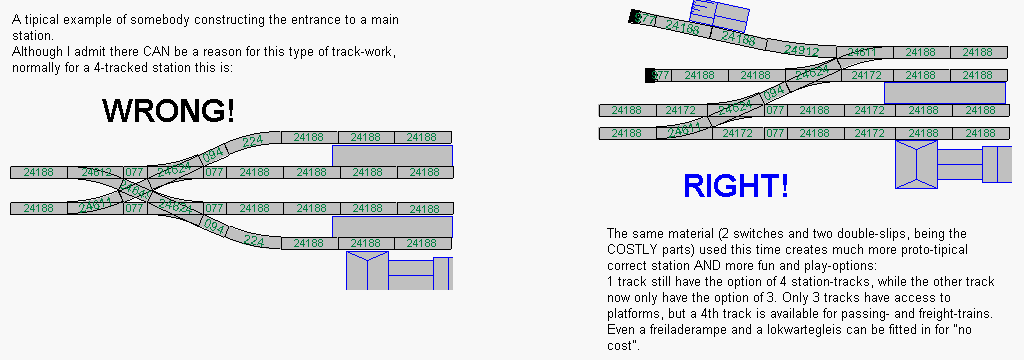
Here is a general way to layout a 4-tracked station. -And an example of the most common design-error.

Terminus station. Right and wrong (Considerations).
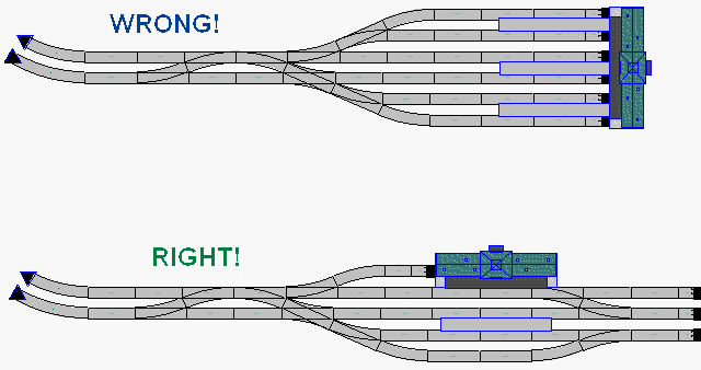
When going for the terminus station theme (NOT one of my favorites!), there are many traps to be aware of!
First off, be carefull not to set up too big an area. In the example shown below, 6 station platform tracks can be fitted
in for little use of space and track-material. BUT... The service tracks and areas needed for a 6-tracked "Grand Central Station"
is enourmous, and requieres a lot of track-work!
Furthermore, at least SOME of the stub end tracks should have swithes permitting a run-around of locomotives.
The 6 tracked station is also unrealistic in terms of operation; The modeller would indeed be VERY busy operating this
station, if he wants to simulate a realistic traffic for a station of this size. (The full automation of terminus stations
with loc-change is almost impossible to do...)
So my advice is: Avoid this as a MAIN theme, and if you MUST have a terminus station, keep its size down.

Terminus station => Actually a through-station.
Much better is it to disguise a simple through-station as a terminal station, using the "False Wall" idea, or different
levels on the landscape (City) to hide one side of the station. For this to work, the station can be constructed at a level
above the tracks (like f.x. Copenhagen), or the tracks can disappear under covered platform halls.
Now the traffic can run through the station, which is easy to automate, and the number of stub-end tracks can be held
down to a minimum, still allowing the modeller to "play" with loc-change and operation.
A large and impressive track-area leading to the platform tracks can still be constructed, giving the sensation of "Grand
Central Station", whilst keeping the trackwork needed on the other side of the station down to a minimum. This is true
even if one does not pretend to make a terminus station: You still "save" on material for making the other side of the
station. I am seriously considering using this method for my own New Project 2004 layout!

Terminus station. A la carte.
I've tried to make a run-down of the possible configurations for a smaller terminus station.
The list covers the use of 2 to 8 switches.
|