|
A city is born.
The city (Of any german origin) is situated on the perimeter of the layout, instead of in the center. This gives the
advantage and liberty in the design of the city to create the illusion of wide roads and plazas, without being obligated to
actually make it all fit inside a small layout. Wether our design is optimal or even any good I will leave for others to deside,
but we (my wife and I) sure had a lot of fun trying different designs on the living-room floor, until we came up with this
"super-optimated" design.
However, constructing the city on the outside of the layout does have the disadvantage of being a lot more difficult
to implement for example street-railcars, or even a Faller Car System, because the trains/cars have nowhere to "hide".
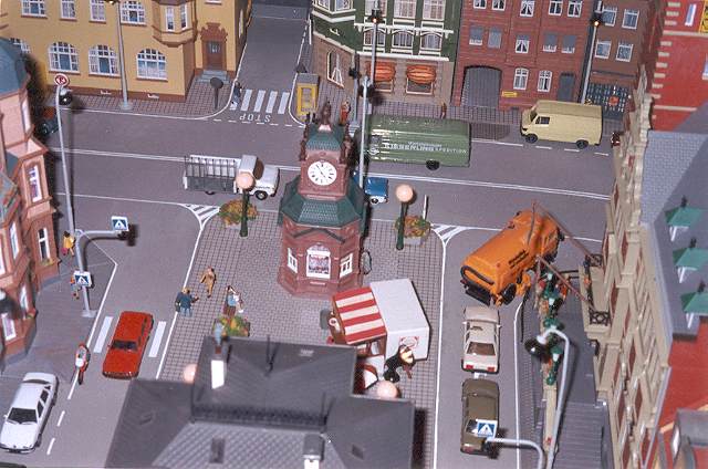
The design above is very close to the final solution, except that the big plaza in front of the station is now smaller,
and instead there is now a small plaza in front of the city hall. (See the picture further down this page)

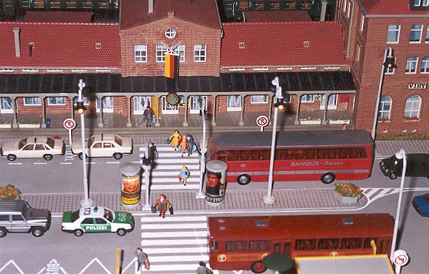
This above photo shows the mainstreet in front of the station. All of the lamps are of the spanish mark "Aneste". Very
nice products at a very reasonable price. You dont really see this mark in Germany (I think), maybe because they have quite
a number of copy-products from Preiser and other famous German marks. (Well, they look like copies, in my opinion)
All figures are handpainted by us.
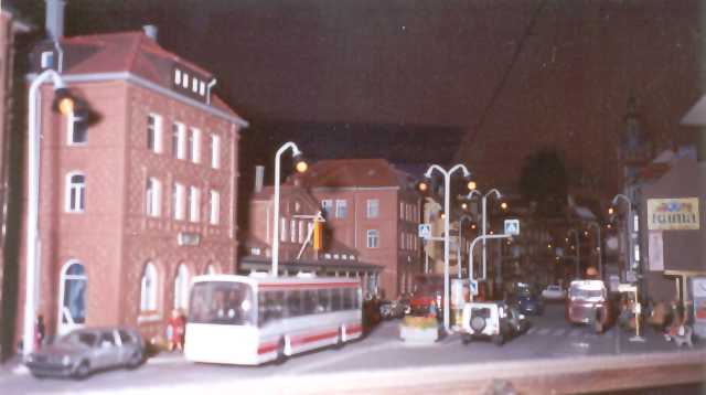
Sorry about the loss of focus in the picture(s). More than show all of the smaller details I hope that at least the photos
show the realistic layout of the city.

The last photo shows the probably biggest mistake with this city: The lack of realistic "dirt". The wear and tear of
a busy mid-german city is totally forgotten here, and the city is left with a totally unrealistic plastic glare.
Anyway, I am learning (although slowly), and am currently assembling a lot of new buildings, which I "age" with
paint. The wet-brush technique I use now for new buildings is not possible with the existing buildings, as the thin paint
would ruin the transparent windows of the already assembled houses. Soon I will try to see what I can do with a little old-style
dry-brush to age the existing buildings...
And talking about windows: It's important to black out around half of the windows with something not transparent, as
it isnt very realistic that all houses always has all lamps lit in the night...
The pathetic plastic-glare apart, maybe you will be able to appreciate the nice details like the spotlight iluminating
the city-hall. The completely hand-painted white lines on the roads. The hotdog-stand situated in the town-square (danish
style)

|